.png)
Von
tobias

12.10.2025
💼 B2B ads that work
How B2B ads stand out
This is how you create banners that immediately stand out and convert.
Banners are like mini shop windows.
You only have a few seconds to make someone curious.
And if your banner isn't immediately convincing, you simply keep scrolling.
But don't worry—here's the perfect guide.
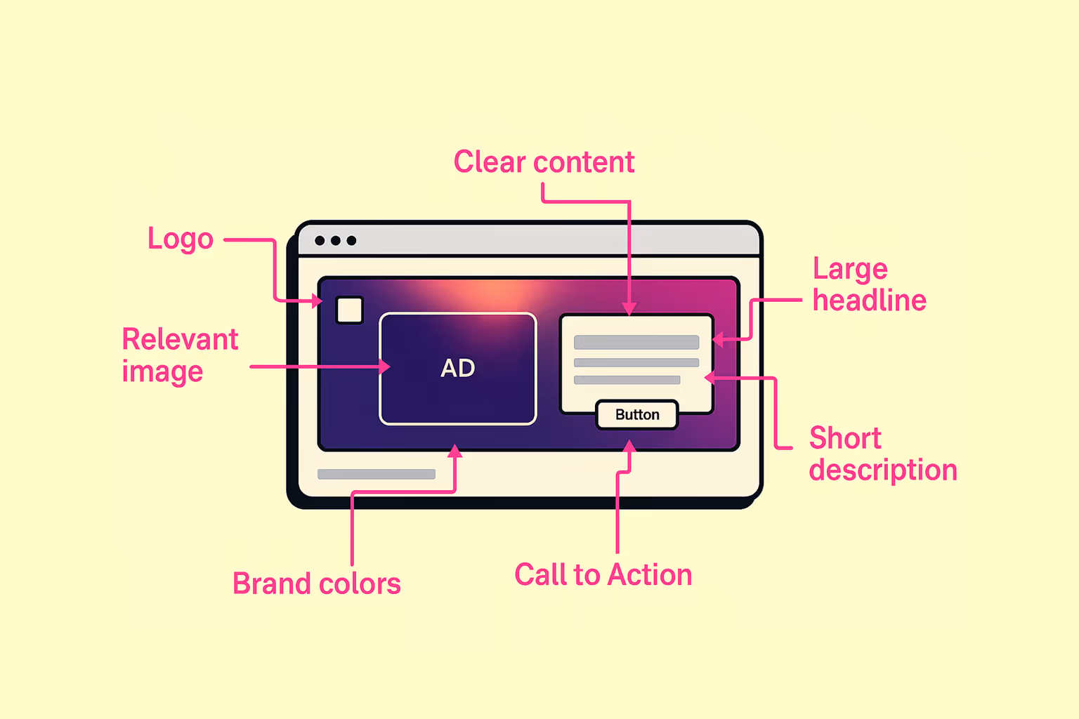
Based on our visual: Anatomy of a Banner ad
You'll see: A good banner is not rocket science, but solid craftsmanship.
Your logo belongs on the banner — of course.
But please don't pop huge into the middle.
It should be visible but not interfere.
The focus is on the message, not on your brand ego.
Use an image that matches the message.
Not a generic stock photo that you've already seen 20 times.
Show a product, a feeling, or a scene that clicks right away.
A banner is not a flyer.
A few words, a clear statement.
Write what's happening — and make it easy to understand.
The headline is the eye-catcher.
She must immediately catch the eye.
Short, specific, readable.
And gladly with a small aha effect.
If you want to explain a bit more, this is the place for it.
But please in one sentence — maximum two.
You want to inform, not deter.
The button is your sales manager.
Tell the user what they should do.
For example:
Without CTA = no direction = no click.
Use your burn colors.
But so that they help, not interfere.
The banner should look like you — but not like mandatory reading.
When you put all the elements together cleanly, you get a banner that works.
It is not loud. Not intrusive.
But clear, structured and ready to click.
Perfect for ads that aren't just there, but actually perform.


.png)
.png)